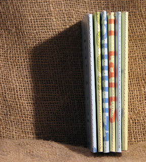
Let’s talk about business cards or as I like to call them Biz Cards. I’ve had a few great debates on the merits of the biz card over the years- about whether artists should or should not have them. Are they worth the money you’ll spend and time in design? How can you design them?
I recommend them. I love my biz cards. I refer to them as little nuggets of marketing and networking GOLD. Business cards condense your contact info down to a small readable format that you can slip into a pocket and pass off at a moments notice. If someone is interested in your work and pursuing more about it at a later time- what’s the best way to give them your telephone number and contact info? A post it fished from the bottom of your bag? Nope hand them a biz card.
The useful attributes of a biz card are as follow: Everyone knows what they are; you don’t need to reinvent the contact wheel, just go with the flow. They are small, immensely portable and cheap. So you can take them with you anywhere- plane, train and automobile. Putting 10 cards into your go bag won’t weigh you down. Heading out to paint in public? TAKE SOME CARDS! Because they are cheap and portable you won’t mind passing them out. The best thing about them is that in this small portable format you have everything you need for contact information- phone number, address, website and name. (All those items aren’t needed for a good card but are good prospects.) When someone asks you for your info, there’s no awkward attempts to remember your phone number or email address, it’s all there. All in all they are super easy.
I take a small stack with me everywhere. I keep a few in my bag, and a few in my to go notebook. Just in case I talk about my book or art and someone wants to see more I give them a card. I hand them out like they are going out of style. In my 5 or so years of using them regularly I think I’ve made and handed out thousands.
Most office supply stores offer an inexpensive service to make a basic black and white card- about $10 for a thousand. Staples is running a special to make a certain number while you wait. A great thing is to look at the publishing software on your computer and see what sort of templates are on there- adapt them to suit your needs. This is great if you move around a lot. You can print off 10 or 500. Office supply stores also carry biz card blanks- perforated sheets of cardstock in biz card size. Print and tear. Easy. I happen to use cardstock from the craft store- I buy the color I like by the packages- 100 sheets, print up 20 or 30 sheets at a time and cut them by hand. This lets me change them however I like and I can print them when ever I like- it’s on demand.
As far as information on your cards- name, title, website, email and a phone number (if you want).
I include a blurb about what I do- artist and bookbinder and my location- city and state as well as my eBay id. I give them out freely- friends, people I just met, and I put 2 in every eBay package I send out. If you are using card stock think about ways you can use the template on your computer to make your cards a little different. They simply need to be around the same size of a biz card 2 inches by 3.5 inches. (I suggest keeping the width about the same as standard- that way they fit into a rolodex.) There are loads of books in B&N and Borders probably in a small local chain about biz card design, some of the ideas are impractical and many are so cool your going to want to use that idea. Take a look at those books make some notes.
Then head back to your studio and think about what you want to impart about your art/website with your cards- rough, rugged, different, tough, durable and earthy were some adjectives I used to describe my work. So I wanted my cards to reflect that. I picked out a paper- kraft paper. Initially I picked a rough chocolate coffee brown cardstock with a neat texture, but it didn’t print well, and then I happened upon a package of kraft paper cardstock, and it was perfect. So that is what I use for everything now. I also found some kraft paper that was perfect for my stationary, and thus I created a complete package around those adjectives that I felt described my work.
Put some though into your design and information and you’ll quickly have a great card that you’ll stick with and want to hand out to everyone.
* a quick note about those prefab cards from staples, I saw a really cool card from an artist that was a inexpensive card from staples- black ink on white paper that the artist quickly stenciled a design onto. The print of the card itself was tactile and nice, and then the image overlaid that and added more interest to the card- still one of the coolest cards I’ve ever seen. So spending $10 on pre-fab cards is great too- you can use them as is or add to them and end up with a fabulous card.
Cross posted to
Comfortable Art Marketing blog.


